Image
Sussman_Ari_1200x1066.png

Ari Sussman is a consultant for CJP whose work focuses on CJP’s day school strategy and relationships.

Yield vs. Effort: Improving Data Collection

Combined Jewish Philanthropies (CJP), Greater Boston’s Federation, has long played the part of a central convener, grant maker, and thought leader for its 14 Jewish day schools. One of its thought leadership roles is the collection and analysis of school data. Over time, CJP has built a number of methods to collect and analyze the unique set of data that comes out of our schools. In the past two years, we have reevaluated the goals and process of CJP’s day school data collection efforts in order to increase their value and lessen their burden on the schools.

We’ve centered all of our efforts around two use cases for data collection:

Network insight: What data might we collect to push our collective day school agenda forward and create a sustainable ecosystem of schools?

School-specific insight: What data might we collect that would allow for smarter action by school leaders?
Based on our previous methods of data collection, we observed three challenges.

Data Entry is Time Consuming 

Given the tremendous pressure school leaders and administrators are under, taking on another tedious responsibility is challenging. Exacerbating the baseline responsibility of data entry is the fact that schools may belong to other associations, such as the Association of Independent Schools of New England (AISNE), that also require them to enter data. Asking our professionals to take a leap of faith and enter data that might pay off for them and our network as a whole is no small ask.

Analysis is Impossible Without Common Definitions 

Another challenge data collectors face is making sure they are defining the information they are asking for clearly such that it is understood in the same way by administrators. As just one example, in an effort to allow schools to benchmark themselves, CJP long asked for information on the size of school admission pipelines. The hypothesis was that if the conversion rate of pipeline size to applications received varied by school, it might allow a school to question what it could learn from another school with a higher pipeline to application conversion rate. 

The challenge is that the concept of an admission pipeline can differ dramatically between schools. One school might define it as having collected an email address, while another could define it as having had a substantive connection with a prospective family by email or over the phone. Aside from hard measures like gross tuition, net tuition, and enrollment size, the vast majority of data points we previously collected bumped up against this definitional challenge.

Framing Data for Action is Hard 

This is perhaps the most critical challenge, and there is no easy solution for it. Even with the data in hand and accurate definitions, the challenge of a central data collector is framing the information in such a way that it comes across as accurate, credible, and clear enough to make the school or the network question its current tactics. On top of those challenges, school heads and administrators possess different levels of comfort with data and have differing capacities to act on it.

Solutions 

While we certainly haven’t designed a perfect solution for all of these challenges, here are a few things we’ve started to do in an effort to tackle these challenges. 

Lean on DASL for Thoughtful Definitions 

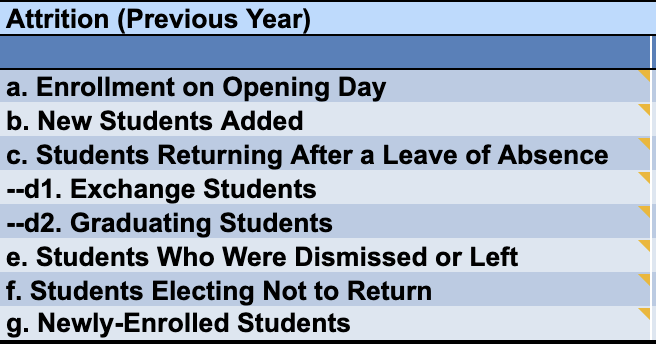
Through Prizmah’s partnership with the National Association of Independent Schools, our schools gained access to their Data Analysis for School Leadership solution (DASL). One of the advantages of this system is the precision of the data-entry fields and definitions they provide to data enterers. With the help of school experts in all the areas of data collection, they have refined the information they request and defined it carefully.

DASL’s definition of student attrition is a good example of this precision:

Image
DASL definitions

While one could simply define attrition as the students who were in the school last year who didn’t come back, DASL has enhanced the precision of attrition by detailing abnormalities like exchange students and students who were dismissed that could throw this definition off. They apply this same deep understanding of school dynamics to all of the areas of data they collect, so that we do not need to recreate our own definitions.

Limit Data Collection 

In the first year of our data reboot, we asked for a wide variety of data and created 20 different views across multiple areas of school operations. In certain areas, like development, we were able to create some useful benchmarks for schools, but the amount of time required for data entry relative to its output value did not warrant our efforts. As a result, we trimmed our data collected by 50% from year one to year two.

Entering the Data Ourselves Where Possible 

In order to further reduce the burden on school administrators while increasing accuracy, we decided to enter all of the financial data ourselves. In previous years, when we had asked for self-reported data on revenue and costs, we had trouble ensuring consistency among the schools. For instance, when we asked for information on philanthropy, some schools entered all giving whereas others entered only unrestricted giving. These sound like easy definitions to notate, but for busy professionals rushing through data entry, these nuances can be hard to specify clearly. This past year, instead of asking for self-reported data, we asked for audited or even pre-audited financials. Because the outputs of school financials are typically similar, it was relatively easy for the team at CJP to simply ask for the financials and do much of the data entry ourselves, thereby ensuring greater accuracy.

Standardize Our Analysis Readouts 

The final, and perhaps most consequential portion of the work, is to figure out how to report on inputted data. There is no easy answer on how to make the readout understandable and actionable. One of our findings was that it is typically not interesting enough for schools to examine their own performance vs. overall average. We found that schools wanted to see their own performance against their peers. We reported these results in an anonymized way, making some efforts to protect each school’s identity. Below is one example of multiyear reporting across a range of schools grouped by category (non-Orthodox K-8, Orthodox K-8, and high school) that allows for peer comparison on absolute measures and rates of growth.

Cost to Educate

Image
Cost to educate graph

While the first year of charting these results was arduous, we did show signs of meeting some of our goals. Among other successes, two schools used their data to make arguments to funders, two reexamined their base teacher compensation, and one became more aware of how facilities could fuel non-tuition revenue lines. For this coming year, with the help of Odelia Epstein at Prizmah, we are hoping to standardize our results in an automated dashboard that can pull our data out of DASL and Excel. This way, in future years, all we need to do is update our existing data set, which will then update the charts available to our school.

We remain convinced that day school data can provide critical insight into the health of our network and ways for schools to improve. That said, we are cognizant of how challenging data entry can be for us as an organization as well as our schools. By regularly evaluating yield versus effort, we maximize the value of our data and serve our schools most effectively.